 Industry
Food & Beverage
Weight Loss
 Service
– UX Design
– UI Design
 Process
Market Research, Competitive Analysis, User Testing, User Flow, Wireframing, Prototyping
 Location
Naples, Florida
BistroMD Snacks Case Study
In this project, we solved the key usability issues by reimagining what it’s like for BistroMD’s new customers to learn about how snacks could impact their weight loss journey and how to maximize their ordering experience. The new design improved the checkout process, helped users better understand the product, and the revenue increased by up to 7%.
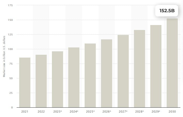
In reviewing the market prediction, I found that the demand for healthy snacks was expected to continue to grow rapidly.
The Claim
The global healthy snacks market size was valued at USD 85.6 billion in 2021 and is expected to expand at a compound annual growth rate (CAGR) of 6.6% from 2022 to 2030. The healthy snack market has soared in recent years, especially since the global pandemic. As customers become more health-conscious, the need for nutritional yet delicious products has been booming.
The Problem
Most commercially available snacks (even many snacks labeled as healthy) include ingredients that contribute to weight gain, and health issues. This effectively hinders current bistroMD customers from staying on the right track to better health and weight loss.
In a quick usability test, we compared customer experience and comments to find patterns. We discovered that users didn’t notice the snack offering at the checkout and some were not certain these snacks were going to help them stay on track to successful weight loss.
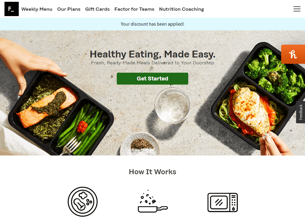
We analyzed 3 popular competitors and looked for positive and negative customer experiences.
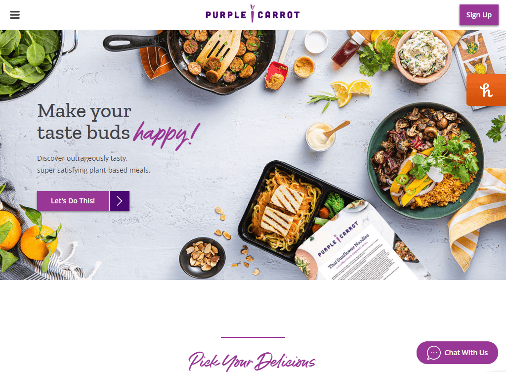
Competitor 1
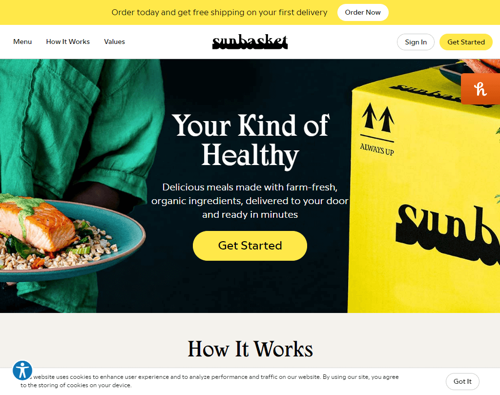
Competitor 2
Competitor 3
All websites offer a wide variety of meal programs and snacks.
Missing list of nutrition facts (competitor 2), the user has to scroll a lot to view snacks (Competitor 1), and the checkout process is missing snack offerings during meal selection (all).
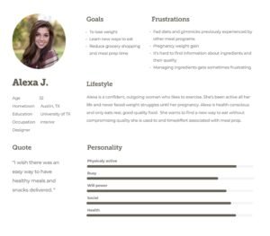
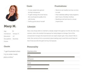
We created 2 personas. One that reflected the consumer’s need for a snack that would keep them on the right track to healthy weight loss. The second one with the need for a more user-friendly interface with an emphasis on accessibility issues.
How Might We Provide A Better Ordering Experience?
How Might We Empower Users To Feel Good About Snacking?
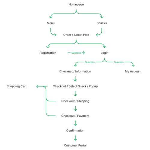
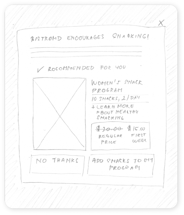
This flow diagram demonstrates the successful state of the necessary functionality of how users go about purchasing the meal program. After logging in users begins the checkout process where they enter their gender. On the next screen, a pop-up appears with snacks offered, optimized for their gender. This solves the missed snack opportunity issue. The fail state flow was also created. The endpoint of this diagram is where the new flow begins inside the customer portal, which includes further customization, preference selection, scheduling, and support.
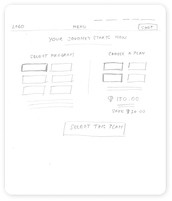
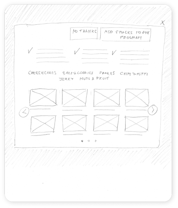
Once the flow diagram was established, the low-fidelity wireframes of the main flow were created.
Mockups
5 high-fidelity designs were created
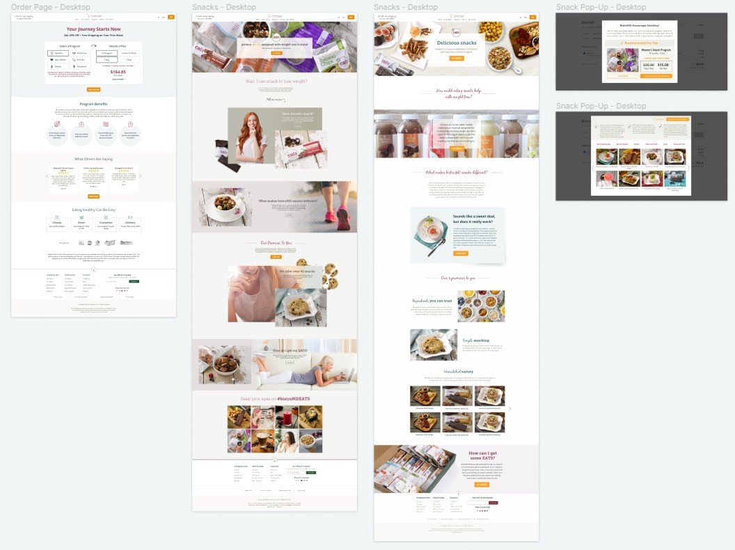
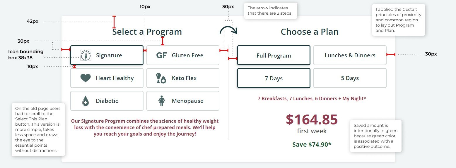
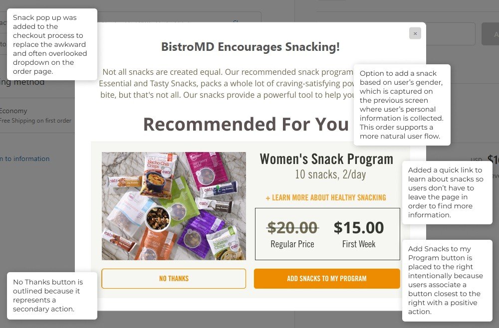
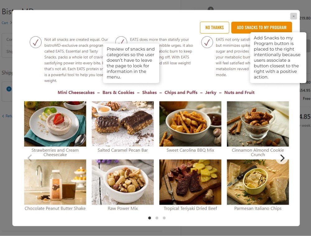
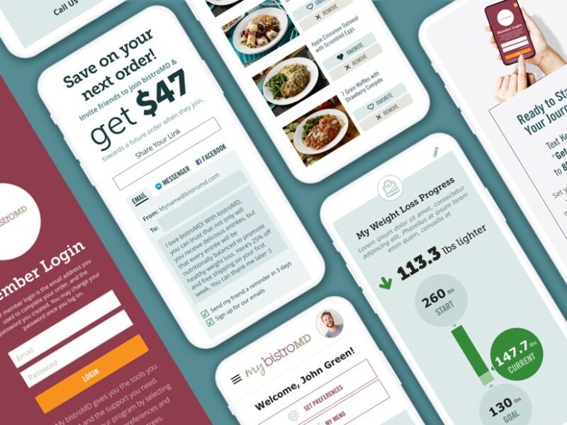
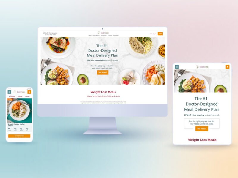
Mockups for Desktop, Tablet and Phone
We moved on to creating mobile mockups including 2 different Snacks pages that were A/B tested.
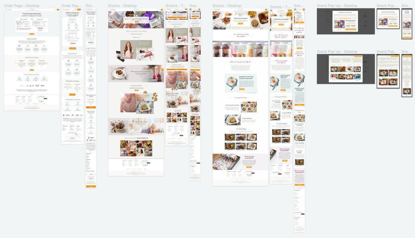
New designs showed up to 7% higher conversion.
Let’s Get In Touch
Contact us today for a free consultation and cost estimate for your project. We work with companies in all industries, and sizes.
Call Now: 239.398.2374
