Service
– UX Design
– UI Design
 Process
Ideation, User Research, Competitive Research, Wireframing, Low and High Fidelity Prototyping, Iteration
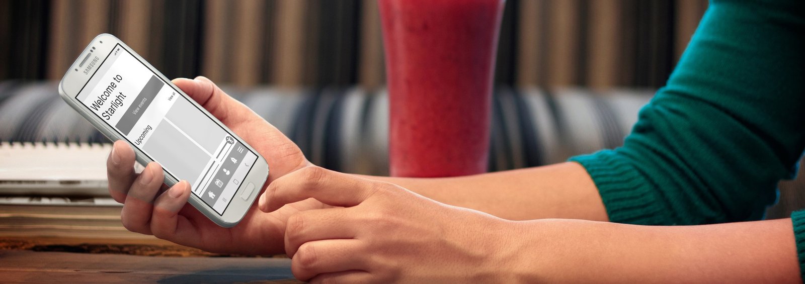
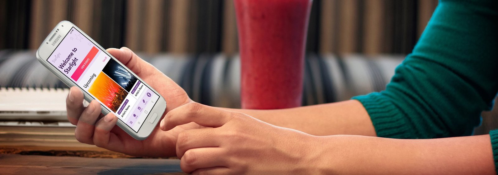
Starlight Music Venue App Case Study
Learn how we solved user issues by conducting interviews, adding features, and applying design thinking.

Starlight is an iconic music venue app that features a list of upcoming events and a ticket booking system.
Problem:
The music venue needs a new app for users to book tickets. The app must be easy to use, accessible, and offer competitive features.
The Goal:
To provide a smooth experience from selecting a ticket to the payment checkout.

![]()
User Research
During this research, a design thinking process was applied. We Empathized with users during the interview process and sought to understand their lifestyles, demographics, goals, challenges, and feelings. Personas that emerged from the Define phase were based on relevant local user groups. My initial thoughts were that most users would be concerned mostly with the payment page itself but found multiple other challenges that provide opportunities for improvement.
Pain Points
Affordability
Some users who can’t afford to pay for a ticket at once should be aware of any available discounts and be able to make a purchase and worry about payments later.
Parking
Finding parking during a crowded event could be difficult. Users should be able to access event parking details and possibly purchase a parking ticket.
Reading Disabilities
Users with reading and visual disabilities may have a difficulty navigating the app unless the app is properly optimized for their needs. Users with disabilities prefer digital wallet payments.
Support Availability
Reaching a support staff often takes too long. Users need multiple support options including being able to speak to someone immediately or within a short queue.
User Personas


User Stories
As a driver, I want to plan and book parking in advance so I can easily walk to the venue without wasting time trying to find parking places.
As a budget-conscious college student, I want to have access to discounts, financing, or price drop alerts so that I could afford to purchase a ticket.
As a customer who faces an issue, I want to be able to reach support staff via call or live chat in under 5 minutes so that I can follow my busy schedule.
As a person with dyslexia, I want to customize my visual preferences and use a digital wallet for payment so that I can navigate the app and make a purchase without asking for help.
User Journey Map
Persona:
Sarah Reed
Goal:
Find a way for her to pay for her ticket so she could go to the venue with her friends
Mapping Sarah’s user journey revealed how useful it would be for users to purchase tickets through the Iconic Music Venue app.

Competitive Audit
Researched and identified direct and indirect competitors and noted their general information such as location, price, offering, business size, target audience, and unique value proposition.
Compiled findings into a competitive audit report and described the competitive audit goals, key competitors, type and quality of competitors’ products, how competitors position themselves in the market, how competitors talk about themselves, competitors’ strengths/weaknesses/gaps, and identified opportunities in the market.


Paper Wireframes
Combining user goals and our observation of top competitors’ apps we drew 6 wireframes of homepage ideas. They include an intro page that informs the user about financing options.

Digital Wireframes
By adding a splash page user will be aware of Buy now, Pay later option before seeing a ticket price


Financing options benefits:
– instant loan approval
– purchase split into payments with no interest
– pay over 6 or 12 months
User Flow

Low-Fidelity Prototype
During the wireframing and prototyping process, we observed user flow from successful competitors and made design decisions that fit Starlight’s user’s needs.

Usability Study
Round 1 Findings
- Users want be clear about how to complete payment after choosing digital wallet/financing option.
- Users want to choose seating from a map
- Users want to access parking information
- Users want to see the least expensive seating option first
Round 2 Findings
- Users want to easily use the event map
- Users want to easily locate the parking information
The new payment app for an iconic music venue helps people split purchase into multiple payments. We learned how users experience the checkout process, including selecting their seats from a map and from the list, applying for financing and completing purchase.
During the usability study we asked participants to follow tasks and at the end to complete the system usability scale.
Mockups
Ticket Selection
Early designs allowed ticket selection on the event detail page. The usability study revealed that users were looking to book a specific seat based on the stage proximity. To solve that we removed the booking option from the event detail page and created a new page dedicated to seat selection where we added an interactive map with seating sections. When a user selects a seating section the list of seats/tickets gets updated. Users also wanted a way to see the most affordable tickets first and for that reason, we added a sorting dropdown.
Users found the accessibility icon obstructing page content. In the new design, the icon has been moved to the footer menu bar.

Parking Information
In the first usability study we learned that users were looking for parking information at the checkout. In the second usability study, we asked users to locate parking information on the checkout page and learned that some users ignored the information icon. We solved this issue by placing a text that said “parking information” next to the icon and changing the color to pink to stand out more.

High-Fidelity Prototype

Accessibility Consideration
Enhancing inclusivity and user experience by making accessibility features available and empowering all users to navigate and interact with digital content effortlessly.

- Optimal size and spacing between navigation icons and button size to accommodate users with unstable hands and help users navigate easier
- Left aligned text, header size based on hierarchy, and sans serif font in contrast color to match accessibility standard for text
- Images include alt tags
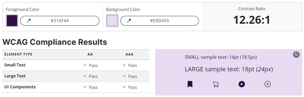
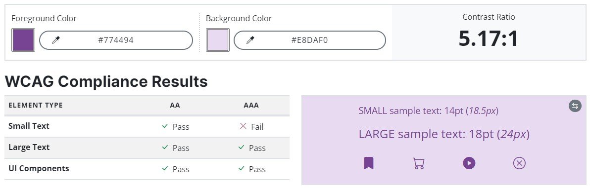
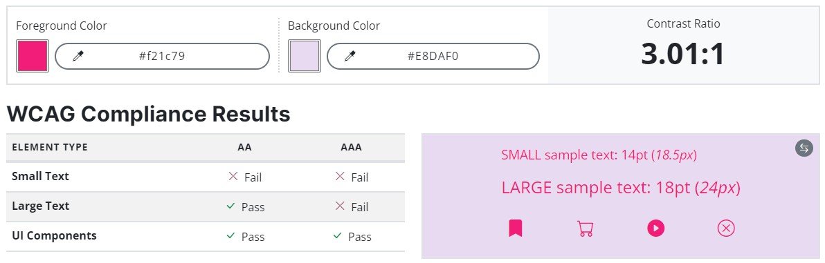
- Contrast check
Style Guide

Let’s Get In Touch
Contact us today for a free consultation and cost estimate for your project. We work with companies in all industries, and sizes.
Call Now: 239.398.2374
Alpha Hub UI
In Case Studies / Fintech UI / UI Design / UX Design / Visual Design / Web Development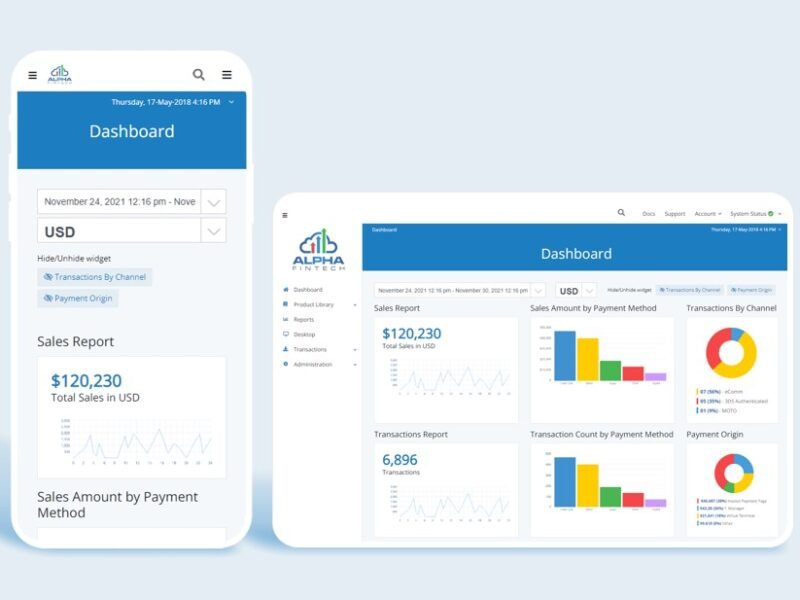
Novatti Payment Page
In Fintech UI / UI Design / Visual Design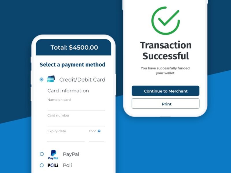
myBistroMD
In Branding / Food & Beverage / Graphic Design / UI Design / Web Design / Web Development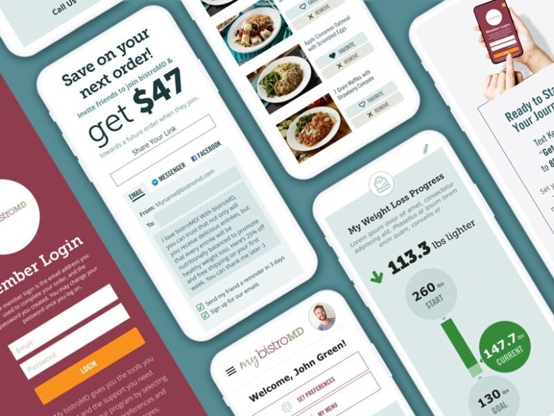
Bank of New Zealand Projects
In Fintech UI / UI Design / UX Design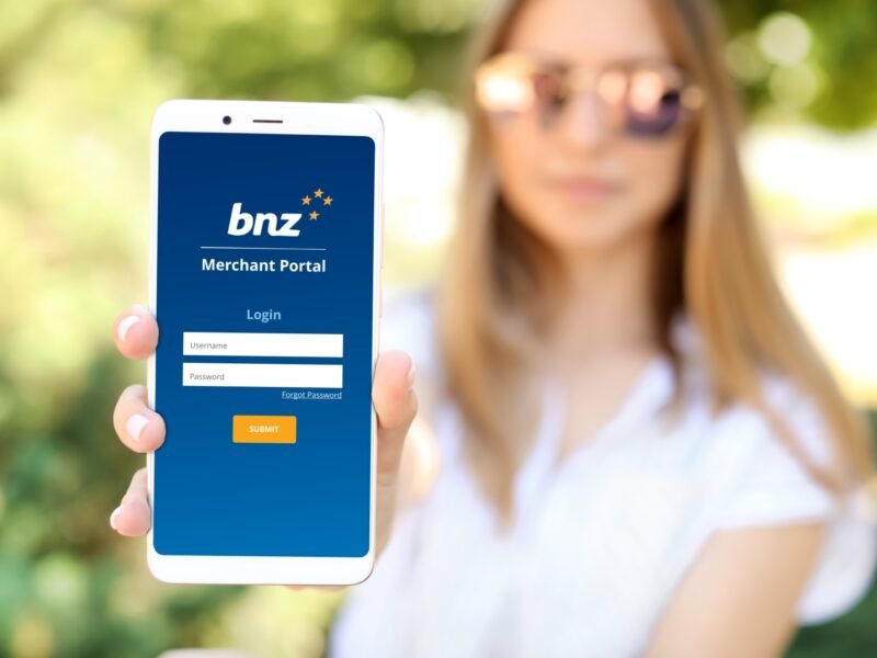
Alpha Fintech Case Study
In Case Studies / Fintech UI / UI Design / UX Design / Web Development / Wordpress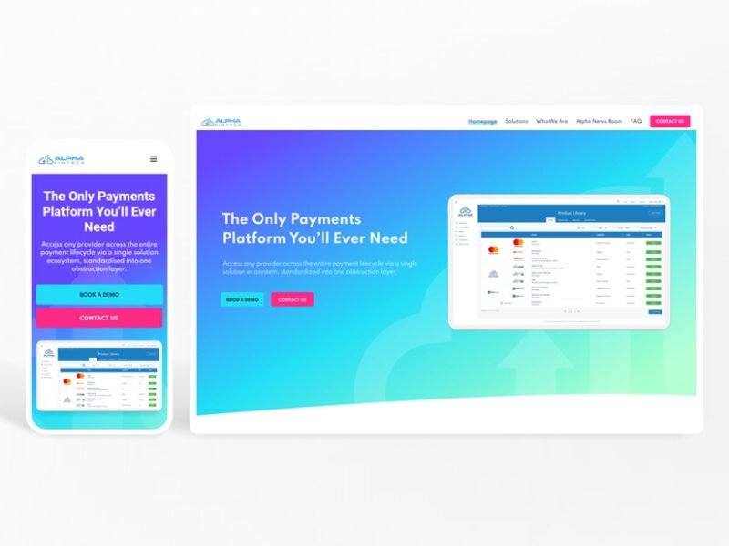
Lake Rosseau Real Estate
In Graphic Design / Real Estate Web Design / UI Design / Web Design / Web Development / Wordpress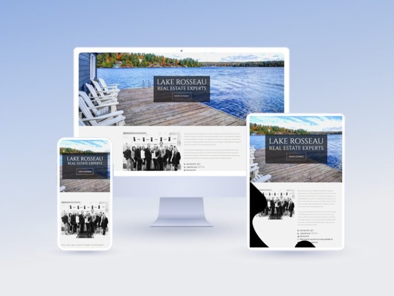
Lake of Bays Real Estate
In Graphic Design / Real Estate Web Design / UI Design / Web Design / Web Development / Wordpress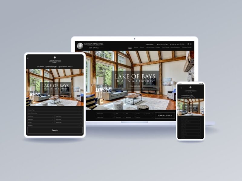
BistroMD
In Branding / Graphic Design / Product Design / UI Design / UX Design / Visual Design / Web Design / Web Development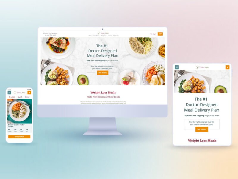
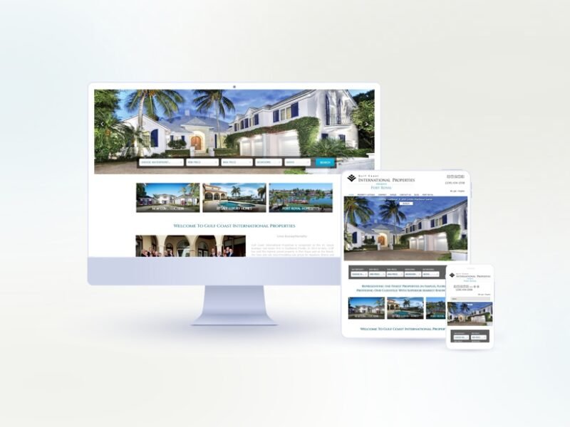
GCIP Naples Port Royal
In Graphic Design / Real Estate Web Design / UI Design / Web Design / Wordpress